
Why You Should Have Your Colours Analysed Before a Professional Photo Shoot
(What to Wear for Branding Photos and Professional Headshots)
Professional photography is an investment.
Whether it is for your business, personal brand, speaking profile, website, print or social media, those images are often the first impression people have of you.
Many people search for advice on what to wear for a professional photo shoot, yet few realise that colour choice is one of the biggest factors affecting how well you photograph.
What many people do not realise is that the colours you wear during your photo shoot can dramatically affect the final result. Wearing the wrong colours can make even the best photography look flat, tired or overly edited.
That is why having your colours analysed before a professional photo shoot can completely transform the outcome.
The Camera Sees Colour Before It Sees You
A camera captures contrast, light and colour very precisely.
This is why understanding which colours photograph well on you personally is so important when preparing for branding photos or professional headshots.
When the colours you wear harmonise with your natural colouring, something powerful happens. Your skin looks clearer, your eyes appear brighter, shadows soften and the viewer notices you first.
When the colour tone is wrong, the opposite happens. The clothing begins to dominate the image, shadows can appear under the eyes and skin can look uneven or tired.
A simple shift in colour tone can even change the message your photograph conveys. Some colours can make you appear stern or unapproachable, while others create warmth and approachability.
Many people assume this can simply be corrected through editing. In reality, editing cannot fully fix the colour imbalance created by the wrong clothing choices.
Photographers can improve an image, but they cannot completely change how colour interacts with your face or whether your clothing overwhelms your natural features.
Even after working as a professional image consultant for more than 18 years, I am still constantly amazed by the difference simply adjusting the tone of a colour can make to someone’s face and the subtle messages colour can convey.
The Right Colours Make Photography Easier
When someone arrives at a photo shoot wearing colours that naturally suit them, the entire process becomes easier.
This is one of the reasons many photographers now recommend colour analysis before a branding photo shoot.
The photographer spends less time correcting skin tones in editing. Lighting behaves more predictably and the images require far less retouching.
Most importantly, the person being photographed feels more relaxed and confident.
When people know they look good in what they are wearing, it changes how they stand, how they smile and how they carry themselves. That confidence always shows up in the final images.
Your Clothing Should Support Your Face
One of the most common mistakes people make when deciding what to wear for a professional photo shoot is choosing clothing based on trends, brand colours or simply what they like.
Unfortunately, what we like is not always what suits us.
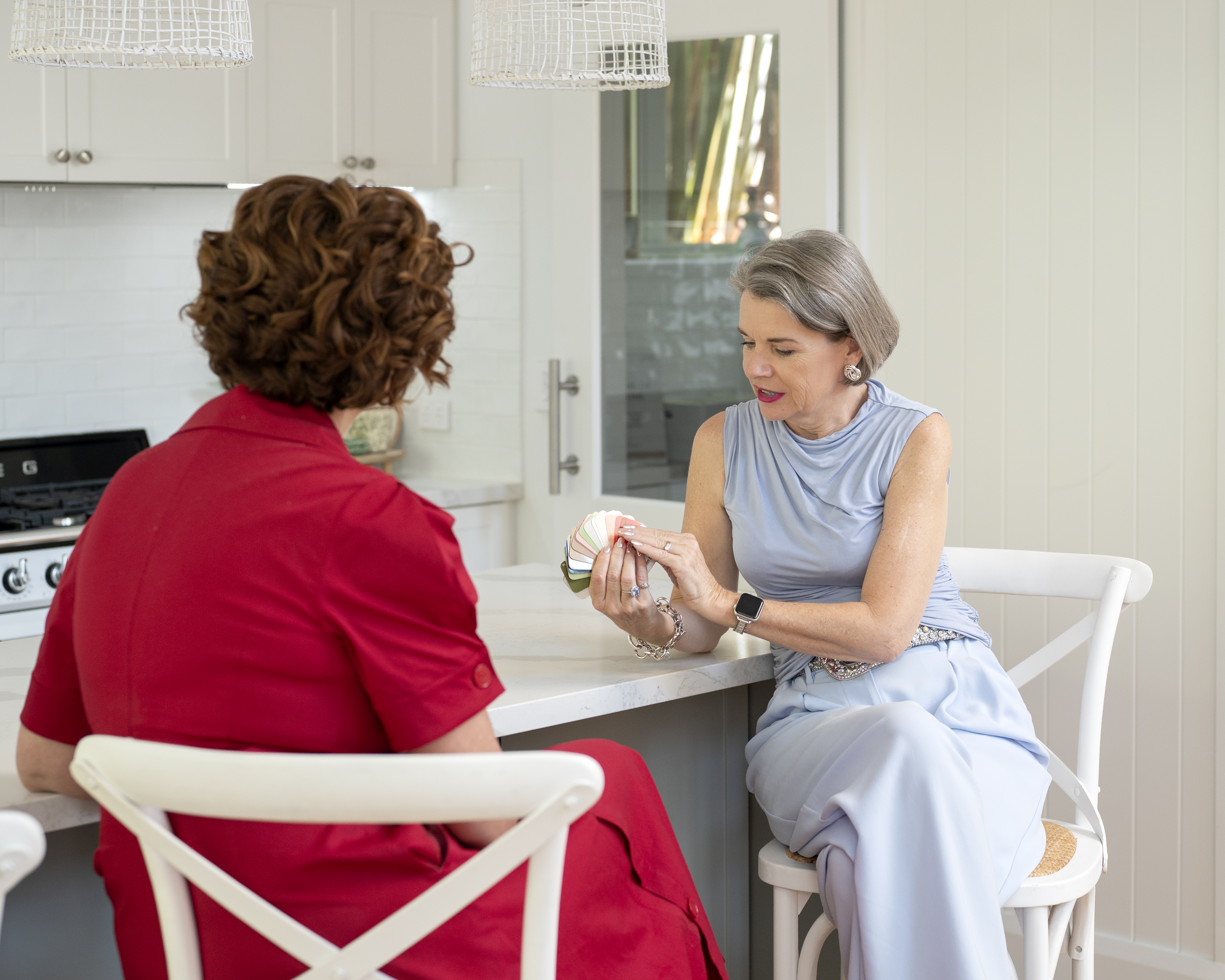
Colour analysis identifies the exact tones that naturally harmonise with your skin tone, hair colour and eye colour. These colours enhance your features rather than competing with them.
The result is a photograph where the viewer sees you first, not the outfit or the brand.
After all, people buy from people they know, like and trust, not simply from a brand name.
Colour Harmony Creates Cohesion With Your Brand
For business owners colour analysis has an additional benefit.
When your clothing colours align with your natural colouring, it becomes much easier to build a cohesive visual brand.
Many of my clients refine their brand palette after their colour consultation so their brand colours harmonise with their personal colouring. This creates a powerful sense of consistency across their:
website
marketing materials
social media
professional photography
The result feels authentic, polished and effortless rather than forced.
The Difference Can Be Remarkable
I recently worked with a client who was launching a new business.
She initially invested in my full day Colour & Style Consultation, which she purchased through her business as part of her rebranding strategy and marketing budget. This allowed her to understand exactly which colour tones and clothing styles suited her best.
Since she was the principal and the face of the business, she adjusted her brand colours slightly so they reflected those tones and created harmony between her personal image and her brand.
Next, we went shopping together to build a wardrobe of outfits in her most flattering colours and styles while also considering the message she wanted her brand imagery to convey.
Finally she had her professional photo shoot.
Because we had carefully planned what to wear for her branding photos, the entire shoot felt natural and effortless.
The difference in her images was extraordinary. She arrived confident in her new colours and styles. She knew she looked the part because the colours supported her face, her clothing aligned with her brand and the photographs required very little editing.
Everything simply worked.
The Secret to Timeless Professional Images
Professional photographs should last for years, not months.
When you wear colours that harmonise with your natural colouring, your images feel timeless and authentic. They continue to represent you well long after the photo shoot.
Trends change.
Your natural colouring does not.
If you are planning a professional photo shoot or branding photos for your business, one of the best investments you can make is understanding the colours and styles that truly suit you.
Because when the colour is right, the camera captures the very best version of you.
